
Lakeshore CI
Saturday, November 24, 2012


Thursday, November 8, 2012
Holton Rower
Friday, November 2, 2012
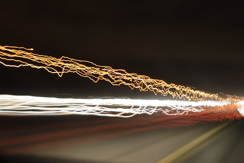
Spin, Re-Done

Tuesday, October 23, 2012
Tuesday, October 2, 2012
You've Got Mail Remake
Original Trailer
The original trailer.
Two business rivals hate each other at the office but fall in love over the internet.-IMDB
As our first big CyberARTS Tech. project we were assigned to create a movie trailer. Sounds easy? Thats what I thought at first. Then we were given the entire outline. We had to take a trailer that was already made and popular, and completely change the genre. For example Thriller to Romance, Romance to Horror, Comedy to Action or Cartoon to Thriller. I had a hard time thinking of a movie to use for this project, I had a list of a dozen movies that would work. I finally decided that changing the Warner Brothers film : You've Got Mail from a romantic-comedy to a creepy stalker-thriller movie.
To create the movie trailer, we had to use iMovie '07. I am more familiar with iMovie '08, and I had to relearn how to use the older version. I still prefer iMovie '08, but I am glad I now know how to properly use iMovie '07
Since there is a strong computer based relationship between the main characters, I decided to focus on that topic. There are a lot of other themes I could of chosen from the trailers, but cyber-relationships are so common that I figured more people could relate.
I wasn't too sure how I would switch the genre of this movie. I watched a variety of thriller trailers to figure out the music score and the order of the clips. I found that the music was constantly intense, to keep the viewer on edge. and the order of the clips was quick paced. I tried a variety of intense music, but only a few suited my trailer. So I stayed with the computer theme and found a recording of the keyboard typing. I think it suits it well. I used the fade-in and fade-out effect a lot in my trailer to create the dramatic pauses.
I also couldn't decide on how to do the voice over. I didn't want one of the typical "movie" voices, so again, I stuck with my theme of the computer. I got one of the "computer" voice generators and I saved it as an audio file and I turned it into my voice over. I think it suits it perfectly.
Below is the completed trailer:
Wednesday, September 26, 2012
I was just goofing around in the kitchen and with my camera and i created this IDEA FOR SPRING SENSATION
Friday, September 21, 2012
"Snow Art" It is an interesting medium to work with. Its only around for a certain time-frame. Which I could imagine would take some serious planning. It gives the artist a fresh canvas and an open mind to do anything with it.
Tuesday, September 18, 2012
http://www.stumbleupon.com/su/1pdhua/:1efTXjlZT:I_mZ2E+O/machoarts.com/15-amazing-animated-short-films/
some short films made by a variety of artists, i havent seen all of them. But so far all of them are really well done!
some short films made by a variety of artists, i havent seen all of them. But so far all of them are really well done!
Friday, September 14, 2012
Thursday, September 13, 2012
youtube to MP4.... really works!
I found this site to download youtube to mp4 formats.
http://www.youtubeinmp4.com/
http://www.youtubeinmp4.com/
Friday, September 7, 2012
Crazy art video, how does someone have the patience to complete this? I wish it told us how long it took to complete this work! I'd imagine weeks, or months!
Sharpie Blog
If you check out this site you can find a blog where people post their Sharpie creations. I realized that their work must take a LONG time. check out the Sharpie blog here.
Also here are some of my favourite sharpie-works.
Also here are some of my favourite sharpie-works.
 |
| Sharpie bedroom |
 |
| Sharpie bathroom |
 |
| Sharpie sculpture. |
Tuesday, July 31, 2012
ARTiculate
The past two weeks I have been involved in a teen arts camp. We had may different artists in to teach us, and as a group we had to pull together a final show to display what we had done. We started the first week off with a wheat-paste artist, who would help us complete a mural that we would install ourselves. We worked with a mosaic artist as well, she helped us with a permanent installation. Next we went dow to Charles street video, this was one of my favourite trips. We had the day to write, storyboard, direct and film a movie that we created ourselves. We also had a dancer come in, she taught us where dance originally started. A musician also came in and we made our own instruments and song. We went downtown to Queen street and visited a variety of galleries. Two of the days we had to go to a library and run an arts program with kids from the ages 4-10. We had a polaroid artist come in that taught us how to turn polaroid pictures into stickers! There were many other artist that came in, but these were the highlights of my two weeks with 12 other up-and-coming artists, Anya, Candace, Charlotte, Claire, Elijah, Felicity, Jake, Laura, Lily, Lukus, Olivier and I had a great time and I hope to see them all next year!
Thursday, June 21, 2012
---Kinetic Typography Assignment---TGJ2OP---
I named my kinetic typography project 'Rocky Balboa
Motivational Speech'. I heard this speech a while ago, and when we had to find a
sound file for the project I kept it as an option. For the project I used Adobe Flash and Adobe
Illustrator. I hardly used Illustrator, I just used it for the words SUNSHINE
in scene 2 and for HIM, HER and ANYBODY in scene 14. I also used Illustrator
for the cat in scene 3 and the cancel sign in scene 7. Towards the end of the
project I was getting really quick with the hot keys, it really does make it a
lot faster. I really like how the final product looks, if I could change anything
it would be keeping my symbols names straight, towards the end I found it more
helpful to name it scene# then the word. I chose to make the background black because
black is a strong colour and I thought it was a strong speech. I used white
font so it would contrast the background and make the words stand out more. I
used Franklin Gothic Medium for the font because it is a bold font and it
looked most like the font on the Rocky movie poster as well. Words that I
wanted to be bold I made it red to contrast both the white and the black. I found that importing illustrator files was
difficult, if there was a little part that I didn’t like I would have to re-do
it, re-import then re-animate. It wasn’t difficult it was the most time
consuming part of the project. I think everyone in the class has really
benefited from the help of the internet, it was a simple solution for most
things and really saved a lot of us. I had to use it right at the end of my
project, I didn’t know how to stop the animation from constantly looping, so I
googled it and it was so simple, even though I had to get someone to show me! I
look back at it, it was very simple to understand, and I was probably
overthinking it. I really like how scene 3 turned out with the cat, I think it
is subtle enough to make an impact but not bold enough to make the words
un-legible. Over all I really like how the whole thing turned out, I think it
looks REALLY good.
Monday, June 11, 2012
Voice Art
Check out Phil Chavez, he is a paralyzed voice painter. There is a video on him that you can see here.
Or you can check out a website to find out more about the voice art here. He was paralyzed from a diving accident which prevented him from painting with a paintbrush. So he decided to create a software that allowed him to draw with his voice
Or you can check out a website to find out more about the voice art here. He was paralyzed from a diving accident which prevented him from painting with a paintbrush. So he decided to create a software that allowed him to draw with his voice
Tuesday, May 22, 2012
RAW vs JPEG
Most modern cameras allow you to shoot in either Raw or JPEG. This site describes in detail the difference between RAW images and JPEGS. Check it out HERE. It is recommended that JPEG format is used for web pictures. RAW format is recommended for professional shooting and higher quality details. RAW format requires post-production editing while JPEG requires hardly nothing.
Photo Site
Check out this site that I found that shows how to use your DSLR to its full abilities. My favourite section of this site is the 73 Photo Locations to Shoot Before You Die.
Friday, April 27, 2012

Photographer
Found this really cool Torontonian Photograher. I really like her stuff, it looks like pictures that you could find in Vouge, but with her own twist on it. Check out Bethany Ramella
Friday, April 20, 2012
Maddie the Coonhound
I found a photographer that has an "interesting" approach to his photography. He travels with his dog, Maddie and..... well..... you have to see it! See Maddie here
Tuesday, April 17, 2012
Kinetic Typography Assignment - TGJ2OP
I named my kinetic typography project Rocky Balboa Motivational Speech. I heard this speech a while ago, and when we had to find a sound file for the project I kept it as an option. For the project I used Adobe Flash and Adobe Illustrator, I hardly used Illustrator, I just used it for the words SUNSHINE in scene 2 and for HIM, HER and ANYBODY in scene 14. I also used Illustrator for the cat in scene 3 and the cancel sign in scene 7. Towards the end of the project I was getting really quick with the hot keys, it really does make it a lot faster. I really like how the final product looks, if I could change anything it would be keeping my symbols names straight, towards the end I found it more helpful to name it scene# then the word. I chose to make the background black because black is a strong colour and I thought it was a strong speech. I used white font so it would contrast the background and make the words stand out more. I used Franklin Gothic Medium for the font because it is a bold font and it looked most like the font on the Rocky movie poster as well. Words that I wanted to be bold I made it red to contrast both the white and the black. I found that importing illustrator files was difficult, if there was a little part that I didn’t like I would have to re-do it, re-import then re-animate. It wasn’t difficult it was the most time consuming part of the project. I think everyone in the class has really benefited from the help of the internet, it was a simple solution for most things and really saved a lot of us. I had to use it right at the end of my project, I didn’t know how to stop the animation from constantly looping, so I googled it and it was so simple, even though I had to get someone to show me! I look back at it, it was very simple to understand, and I was probably overthinking it. I really like how scene 3 turned out with the cat, I think it is subtle enough to make an impact but not bold enough to make the words un-legible. Over all I really like how the whole thing turned out, I think it looks REALLY good.
Thursday, April 12, 2012
Avatar
So I decided I would look up how they made the actors look human, but making them animalistic as well. I found a straight forward tutorial that teaches you how to make yourself look like the Na'vi (click here). I decided I would try the tutorial, but I have a few restrictions, I do not have Photoshop, which was used in the tutorial.
Flash Spring Animation
My first flash animation was an animation of a Jack in the Box jumping out of his box. My design was quite simple, except for the spring. It looked like a spring, but didn't have the bounce that would make it look way more realistic. So I decided I would try to find a way to make the spring look more real. The tutorial I found was for Flash CS5 not CS4, that we have. I still find it really neat how fluid the movement of the "spring" is, check it out here. Since we don't have the version he is using, I checked out his website to see if there was anything there for CS4 flash. Andy Sykes is a UK animator known as, Hexjibber to Youtubers and Animators. He has some really well done animations, my favourite is the lip-syncing one, and he has many other tutorials for flash CS4. Check out Hexjibber.
Tuesday, April 10, 2012
website
I found this really cool website where artists from all over the world can post their artwork. Check it out here. I've noticed most of the work is done digitally, but don't let that fool you , some of the work looks like photos! There is a variety of programs used depending on the artists. Many of the artists left a link of their own site if you really liked their work you can look at some of their other works.
Simplicity
"SIMPLICITY IS ABOUT SUBTRACTING THE OBVIOUS AND ADDING THE MEANINGFUL"
-John Maeda
 |
| Simple Building Structure |
 |
| Simple, yet it can make a statement. |
 |
| Again, simple. But what does it mean? |
| "It is a union that suggests the essential mystery of the world. Art for me is not an end in itself, but a means of evoking that mystery." -Rene Magritte - 1898-1967 | |
Many Artists today are influenced by Magritte's work, Andy Warhol was one modern artist that was influenced. Other artists were and still are influenced either by Magritte's way of incorporating subtle messages or his abstract style, occasionally both. |
Thursday, March 22, 2012
Amazing photoshop!
Wouldn't it be amazing to be this skilled in photoshop? This 3D picture was produced in lightbox and photoshop. The artist doesnt make many 3D photoshop creations, he prefers producing 2D Corel Painter (check it out, it looks really neat!). Enjoy!
"Sally"
By Corrado Vanelli
http://www.landofsecretarts.com/gallery.html

"Sally"
By Corrado Vanelli
http://www.landofsecretarts.com/gallery.html
Thursday, March 8, 2012
Reduction Prints
 |
| Perfect Two |
The most difficult,t part of this assignment was the overall process, it took a lot of time. The concept isn't that difficult, I think there could be a quicker way to get the same result.
I really liked how the birds turned out, more specifically the red one. The lines were really sharp and I liked how the face and the beak lined up almost perfectly.
My design has good balance with the birds in opposite corners, and the branches splitting up the white background. I also thought i used negative and positive space well, I hoped the background would of stayed whiter, but it was difficult because of how many colours I had.
I would of liked to of seen what my print would of looked like with a coloured background. I think it would change the look of my design COMPLETELY! Overall I really enjoyed the process and I am really happy with the final products.
I would of liked to of seen what my print would of looked like with a coloured background. I think it would change the look of my design COMPLETELY! Overall I really enjoyed the process and I am really happy with the final products.
Subscribe to:
Posts (Atom)